Timeline JS – Beautifully crafted timelines that are easy, and intuitive to use..
Autor: Sven
-
What to Expect in WordPress 3.7 and 3.8 – WPMU.org
All hands are on deck as work on WordPress 3.7 and 3.8 gets underway, just a couple of weeks after WordPress 3.6 was shipped.
Lead core developer Andrew Nacin, who is leading 3.7, and WordPress co-founder Matt Mullenweg, who is heading up 3.8, recently held planning meetings for their respective versions to gather feature ideas and get developers into teams.
As Mullenweg announced in his State of the Word address at WordCamp San Francisco, 3.7 and 3.8 are being developed simultaneously, a first for WordPress. While 3.7 will focus on stability and security, 3.8 will be experimental and its features will be initially developed as plugins.
So what can we expect in these upcoming releases?
-
Überüberschrift – Wikipedia
- Überschrift – Wikipedia.
- de.wikipedia.org/wiki/Schlagzeile
- de.wikipedia.org/wiki/Lead-Stil
- www.google.com/search?q=Informationsschlagzeile+%3…
- www.teachsam.de/deutsch/d_schreibf/schr_beruf/jour…
- de.wikipedia.org/wiki/Lead-Stil
- www.google.com/search?q=Informationsschlagzeile+%3…
- www.teachsam.de/deutsch/d_schreibf/schr_beruf/jour…
- www.google.com/search?q=untertitel+%C3%BCbertitel&…
- www.google.com/search?q=%C3%BCber%C3%9Cberschrift&…
- www.mediengestalter.info/forum/4/wie-heisst-nochma…
- de.wikipedia.org/wiki/Spitzmarke
- de.wikipedia.org/wiki/Teaser
-
Download Facebook Photo Album In a Blink of An Eye | Things I’ve Learned
Download Facebook Photo Album In a Blink of An Eye
May 7, 2010 kokyun Leave a comment Go to comments
After I’ve tried all Facebook photo album downloader, including FacePAD, Bloom and some other applications, one word to describe, slowwwwww.
Here is the best way to download your album, please follow the steps given below. instead of waiting hours and hours to finish your download, why don’t wait minutes only because time is money.
via Download Facebook Photo Album In a Blink of An Eye | Things I’ve Learned.
-
Facebook-Apps – Bildgrößen
Bild für Seitenreiter 111 x 74
Die Größe des Bildes muss 111 x 74 Pixel betragen. Du kannst eine JPG-, GIF- oder PNG-Datei hochladen. Maximale Dateigröße 5 MB. Wenn das Hochladen nicht funktioniert, versuche es mit einem kleineren Bild. Datei auswählen Durch das Hochladen dieser Datei bestätigst du, dass du die Rechte zur Verbreitung dieses Bildes besitzst und dass es nicht pornografisch ist.
Primary Icons
16×16 px und 75x75px
Zusätzliche Miniaturbilder
128×128
Upload a 128 x 128 pixel icon for your web app detail page and high-resolution mobile screens. Make sure the background isn’t white at the edges or corners.
Banner
Web-Banner 155×100
Upload a 155 x 100 pixel banner for App Center lists (ex: Top Apps, Friends‘ Apps) on the web. Make sure the background isn’t white at the edges or the corners and that your app name is included.
Cover Image 800×150
Upload a 800 x 150 pixel cover image for your app detail page.
Zusätzliche Banner (optional)
Small Web Editor’s Pick 180 x 115
Upload a 180 x 115 pixel banner that will be used if your app is featured in a web App Center ad. Make sure the background isn’t white at the edges or the corners and that your app name is included.
Large Web Editor’s Pick 394 x 150
Upload a 394 x 150 pixel banner that will be used if your app is featured in a web App Center editorial. Make sure the background isn’t white at the edges or the corners and that your app name is included.
-
Facebook-Bildgrößen
Facebook Titelbild (Cover Photo)
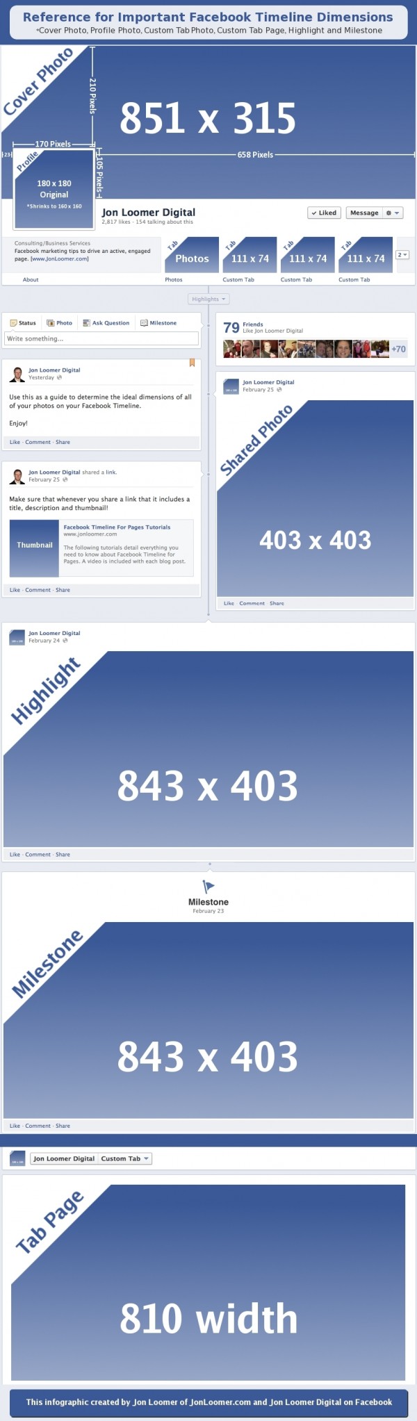
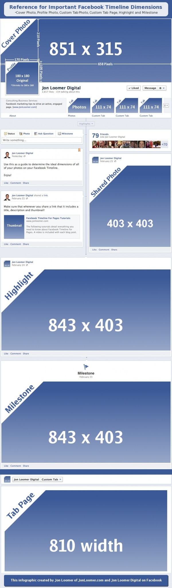
Das breite Titelbild, welches auf dem Facebook-Profil oder der Firmen-Seite ganz oben quer platziert ist hat die Abmessungen 851 x 315 Pixel (Breite x Höhe in px).
Facebook Profil Bild (Profile Photo)
Das Profilbild, welches meistens das Gesicht des Nutzers oder das Firmenlogo zeigt, wird auf 160 x 160 Pixel optimiert.
Geteilte Bilder (Shared Photo)
Fotos, die Du mit Deinen Freunden auf Facebook teilst, erscheinen mit einer maximalen Kantenlänge von 403 x 403 Pixeln.
Tab Imgage (Custom Tab Logo)
Hier geht es um die 4 kleinen querformatigen Vorschau-Images in denen deine Freunde oder gelikte Seiten erscheinen. Diese haben die Auflösung 111 x 74 px.
Meilenstein oder Highlight Bild (Milestone Photo)
Definierst Du ein Bild oder Ereignis als Meilenstein oder Highlight, so darf das Image bis zu 843 x 403 Pixel im Querformat breit sein. Definitiv das größte mögliche Format.
Tap Seite (Tap Page)
Der Header einer Facebook Tab Seite ist optimal 810 Pixel breit.
-
WebDesignTunes Themes | Theme : TBLOG
WebDesignTunes Themes | Theme : TBLOG.
Demo der REsponsive-CSSs
-
WordPress – Vernissage: Responsive Photography / Portfolio Themes
Das Problem mit responsiven Portfolio-Themes ist, dass viele eine wunderschöne Startseite haben, aber in den Einzelseiten abfallen, wenn die eigentliche Detaqilpräsentation laufen sollte. Da ist dann oft gleich wieder nur der übliche WordPress-Blogpost mit Seitenmenü viel Blabla und Kommentarblock und darüber das Foto aus der Preview in leicht größer ohne Möglichkeit, eine Slideeshow abzufeiern, schon gar nicht im Fiullscreen-Modus. Es folgt die Dokumentation einer Suche nach dem Gral.
- WordPress – Vernissage: Responsive Photography/Portfolio Theme | ThemeForest
- Expression Photography Responsive WordPress Theme
- Konzept – Fullscreen Portfolio WordPress Theme
Und hier noch ein paar mehr: netfruits.com/2013/05/excellent-fullscreen-wordpre…
Free
www.dessign.net/art-works-responsive-theme-free-20…
-
Tutorials | Codrops
In this section you will find in-depth how-tos involving common web development and web design techniques.
via Tutorials | Codrops.
-
wp-filemanager | Anant Shrivastava : Techno Enthusiast
Anant Shrivastava : Techno Enthusiast
My journey into the world of virtual reality.
Main menu
Skip to content
Home
About
Funny Quotes
Hackers and Geeks Weekly
Projects
scripting
Disclaimer
wp-filemanager
WP-Filemanager is your one stop solution for all file management work right from the wordpress admin page.
-
WordPress: Tastaturkürzel für schnelleres Schreiben im Editor | WordPress-Bücher
Mit Tastaturbelegungen arbeitet glaube ich mittlerweile jeder. Am häufigsten genutzt wird wahrscheinlich Strg+C und Stg+V, gerne natürlich auch Strg+Z. Auch bei der Arbeit mit Office nutze ich oft Tastaturkürzel zum formatieren von Texten, aber beim Verfassen von Blogartikeln nutze ich sie nie. Warum eigentlich nicht? Ein Grund ist sicherlich, dass sie mir (bis dato) nicht soo geläufig waren. Also Grund genug, sich diese nach dem Hinweis von @trishacupra noch einmal genau anzuschauen und einzuprägen – so schwer ist das nämlich nicht.
Aufpassen muss man lediglich, weil es unterschiedliche Tastaturkürzel gibt, abhängig davon welchen Editor man nutzt. Außerdem decken die Tastaturkürzel unterschiedliche Sachen ab.
Tastaturkürzel im HTML-Editor
englisch Tastaturkürzel deutsch
Bold: Alt+SHIFT+b fett
Italics: Alt+SHIFT+i kursiv
del (strikethrough): Alt+SHIFT+d durchgestrichen
ins (insert date/time): Alt+SHIFT+s eingefügt
Link: Alt+SHIFT+a Link
Insert img URL: ALT-SHIFT-m Bild einfügen
Blockquote: Alt+SHIFT+q Zitat
Code: Alt+SHIFT+c Code
Read More: Alt+SHIFT+t Mehr
Unordered List (ul): Alt+SHIFT+u Unsortierte Liste
Ordered List (ol): Alt+SHIFT+o Sortierte Liste
List Item (li): Alt+SHIFT+l Listeneintrag
Viele Themes, Templates und Layouts
Tastaturkürzel im Visuellen Editor
englisch Tastaturkürzel deutsch
Advanced Editor: Alt+SHIFT+z Werkzeugleiste ein/aus
Align Left: Alt+SHIFT+l linksbündig
Align Center: Alt+SHIFT+c zentriert
Align Right: Alt+SHIFT+r rechtsbündig
H1 Header: STRG+1 Überschrift 1
H2 Header: STRG+2 Überschrift 2
H3 Header: STRG+3 Überschrift 3
H4 Header: STRG+4 Überschrift 4
H5 Header: STRG+5 Überschrift 5
H6 Header: STRG+6 Überschrift 6
Paragraph: STRG+7 Absatz
Format: STRG+8 Format
Address: STRG+9 Adresse
Zwischen den Editoren (HTML und Visuell) kann man übrigens mit den Tastenkombination Alt+Shift+e hin und her schalten.
Noch kurz erwähnt
Kleiner Hinweis am Rande: durch das ganze Testen hatte ich auf einmal die englische Tastaturbelegung (QWERTY) geladen. Das geht nämlich auch ganz schnell mit einem Tastaturkürzel Shift + Alt. Mit dem gleichen Kürzel lädt man aber auch wieder die deutsche Tastaturbelegung (QWERTZ)
via WordPress: Tastaturkürzel für schnelleres Schreiben im Editor | WordPress-Bücher.
-
Media Queries for Standard Devices
via <a href="http://css-tricks.com/snippets/css/media-queries-for-standard-devices/">CSS-Tricks</a> /* Smartphones (portrait and landscape) ----------- */ @media only screen and (min-device-width : 320px) and (max-device-width : 480px) { /* Styles */ } /* Smartphones (landscape) ----------- */ @media only screen and (min-width : 321px) { /* Styles */ } /* Smartphones (portrait) ----------- */ @media only screen and (max-width : 320px) { /* Styles */ } /* iPads (portrait and landscape) ----------- */ @media only screen and (min-device-width : 768px) and (max-device-width : 1024px) { /* Styles */ } /* iPads (landscape) ----------- */ @media only screen and (min-device-width : 768px) and (max-device-width : 1024px) and (orientation : landscape) { /* Styles */ } /* iPads (portrait) ----------- */ @media only screen and (min-device-width : 768px) and (max-device-width : 1024px) and (orientation : portrait) { /* Styles */ } /* Desktops and laptops ----------- */ @media only screen and (min-width : 1224px) { /* Styles */ } /* Large screens ----------- */ @media only screen and (min-width : 1824px) { /* Styles */ } /* iPhone 4 ----------- */ @media only screen and (-webkit-min-device-pixel-ratio : 1.5), only screen and (min-device-pixel-ratio : 1.5) { /* Styles */ } -
CSS media queries: width versus device-width
width versus device-width
In CSS media the difference between width and device-width can be a bit muddled, so lets expound on that a bit. device-width refers to the width of the device itself, in other words, the screen resolution of the device. Lets say your screen’s resolution is 1440 x 900. This means the screen is 1440 pixels across, so it has a device-width of 1440px. Most mobile phones have a device-width of 480px or lower, including the popular iPhone 4 (with device-width: 320px), despite it technically having a 640 x 960 resolution. This is due to iPhone 4’s retina display, which crams two device pixels into each CSS pixel on the screen. This is true for the Ipad 3 as well; its reported device-width is 768px just like its predecessors, even though its actual screen resolution is 1536px x 2048px. In general width is more versatile when it comes to creating responsive webpages, though device-width is useful when you wish to specifically target mobile devices (and not desktops with a small browser window for example), as rarely do desktops have screen resolutions below a certain number such as 320px x 480px.
The below shows the screen resolution and CSS media device dimensions of some of the popular devices out there:
CSS Media Dimensions Device resolution (px) device-width/ device-height (px) iPhone 320 x 480 320 x 480, in both portrait and landscape mode iPhone 4 640 x 960 320 x 480, in both portrait and landscape modeCSS
pixel density is 2iPad 1 and 2 768 x 1024 768 x 1024, in both portrait and landscape mode iPad 3 1536 x 2048 768 x 1024, in both portrait and landscape modeCSS
pixel density is 2Samsung Galaxy S I and II 480 x 800 320 x 533, in portrait modeCSS pixel density is 1.5 Samsung Galaxy S III 720 x 1280 360? x 640?, in portrait mode HTC Evo 3D 540 x 960 360 x 640, portrait modeCSS pixel density is 1.5 Amazon Kindle Fire 1024 x 600 1024 x 600, landscape mode -
Wie sicher ist dein Passwort? » WordPress Deutschland News
Passwortsicherheit keine reine Privatsache ist. Einmal gehackte Blogs können als Bot-Netzwerke missbraucht werden und Malware verbreiten – mit ärgerlichen Konsequenzen für alle Besucher der infizierten Seiten.
via Wie sicher ist dein Passwort? » WordPress Deutschland News.
-
Words for WP | Professional Content for WordPress Businesses
Ein cleanes Theme mit Scribble-Elementen kommt sehr stylish:
Words for WP | Professional Content for WordPress Businesses.