Nach diversen Spekulationen über Ursache und Auswirkungen der CPU-Sicherheitslücke nehmen Intel und Google Stellung. Google veröffentlicht Details, außerdem zeigten Sicherheitsforscher mit Spectre und Meltdown zwei Angriffsszenarien.Die Berichte über eine gravierende Sicherheitslücke in Intel-CPUs, die sensible Daten für Angreifer auslesbar machen und aufgrund der notwendigen Updates Performance-Einbußen bringen soll, haben nun zu Reaktionen von Herstellern geführt. Sie wollen die Spekulationen mit ersten Informationen korrigieren und die Schwere der Lücke sowie die Auswirkungen ins rechte Licht rücken.Google immerhin veröffentlicht im Rahmen seines Project Zero auch Details zu der Lücke, Sicherheitsforscher haben mit Meltdown und Spectre zudem zwei Angriffsszenarien beschrieben, die das Leck ausnutzen.
Kategorie: Check That!
-
Gravierende Prozessor-Sicherheitslücke: Nicht nur Intel-CPUs betroffen, erste Details und Updates
-
Insights: New Facebook Page Design 2016 | Rudi Gabriel Bedy – Online Marketing
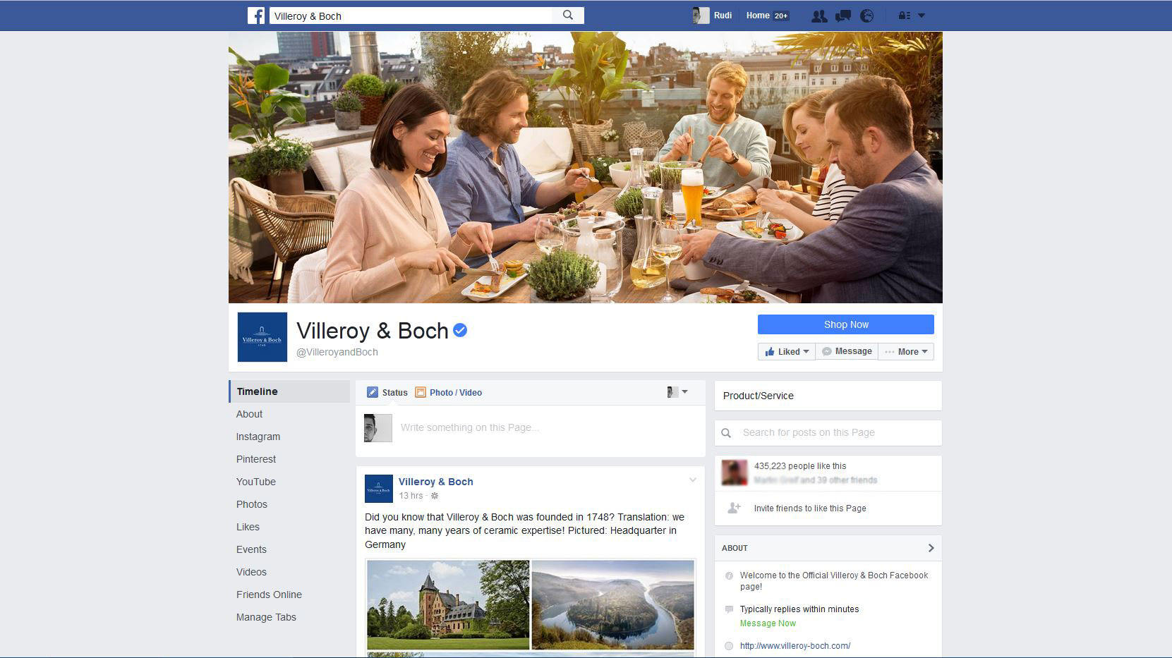 Facebook works again on a new design for it’s Pages. In the new design they mostly changed the public view of the Facebook Page, but also the Admin view.
Quelle: Insights: New Facebook Page Design 2016 | Rudi Gabriel Bedy – Online Marketing
-
Facebook’s testing another ad-free Pages design for desktop
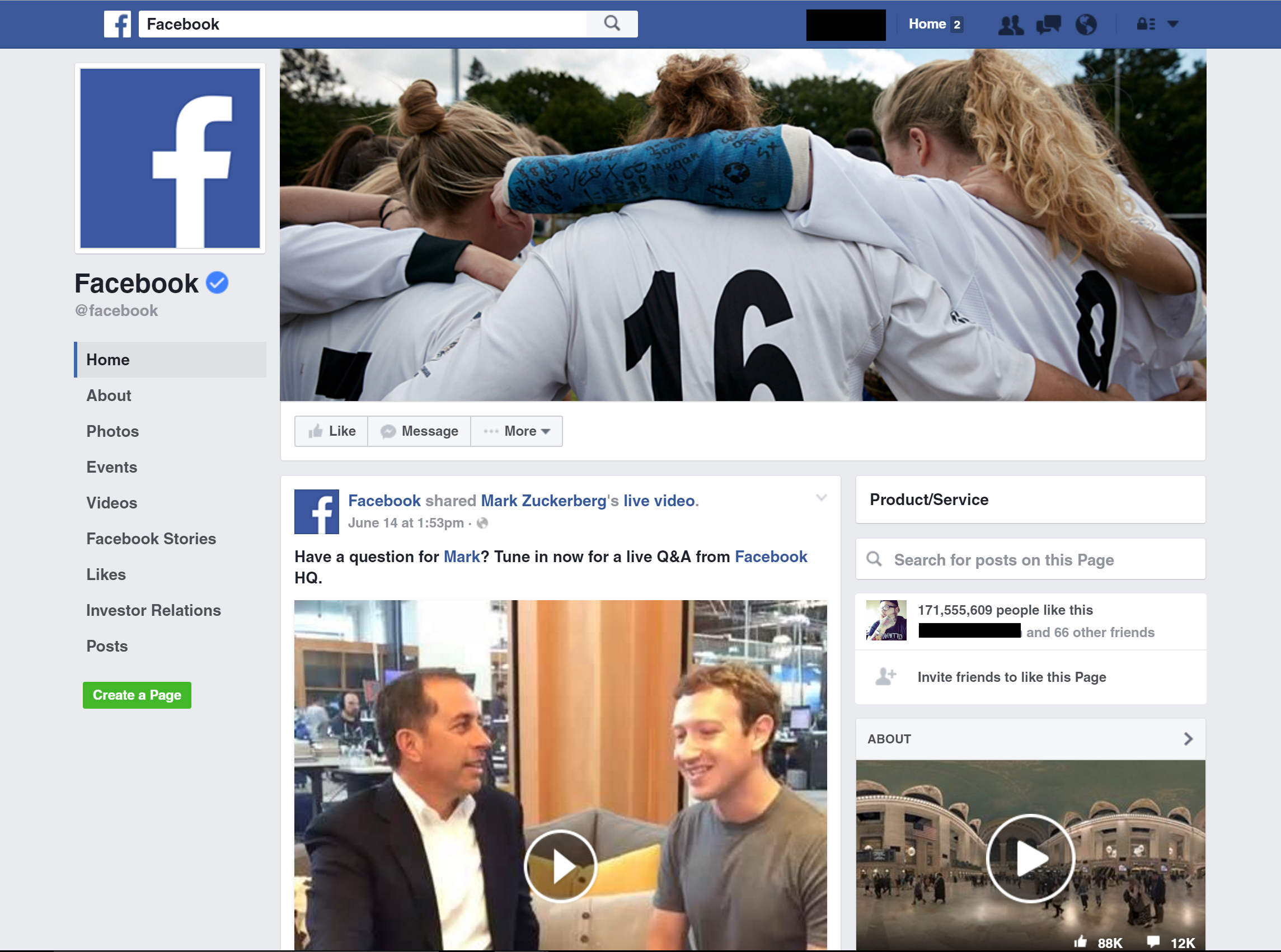 Facebook is testing a new look for its desktop Pages that drops right-hand ads and repositions the page’s cover photo, profile photo and navigation bar.
Quelle: Facebook’s testing another ad-free Pages design for desktop
-
Organischer Linkaufbau mit der Sauercrowd — Sauercrowd
 Die Cans of Links ermöglichen nachhaltigen Linkaufbau mit natürlichen Backlinks für eine erfolgreiche Steigerung der Sichtbarkeit.
Quelle: Organischer Linkaufbau mit der Sauercrowd — Sauercrowd
-
Co.Design | business + design

Inspiring stories about innovation and business, seen through the lens of design.
Quelle: Co.Design | business + design
-
CSS media queries: width versus device-width
width versus device-width
In CSS media the difference between width and device-width can be a bit muddled, so lets expound on that a bit. device-width refers to the width of the device itself, in other words, the screen resolution of the device. Lets say your screen’s resolution is 1440 x 900. This means the screen is 1440 pixels across, so it has a device-width of 1440px. Most mobile phones have a device-width of 480px or lower, including the popular iPhone 4 (with device-width: 320px), despite it technically having a 640 x 960 resolution. This is due to iPhone 4’s retina display, which crams two device pixels into each CSS pixel on the screen. This is true for the Ipad 3 as well; its reported device-width is 768px just like its predecessors, even though its actual screen resolution is 1536px x 2048px. In general width is more versatile when it comes to creating responsive webpages, though device-width is useful when you wish to specifically target mobile devices (and not desktops with a small browser window for example), as rarely do desktops have screen resolutions below a certain number such as 320px x 480px.
The below shows the screen resolution and CSS media device dimensions of some of the popular devices out there:
CSS Media Dimensions Device resolution (px) device-width/ device-height (px) iPhone 320 x 480 320 x 480, in both portrait and landscape mode iPhone 4 640 x 960 320 x 480, in both portrait and landscape modeCSS
pixel density is 2iPad 1 and 2 768 x 1024 768 x 1024, in both portrait and landscape mode iPad 3 1536 x 2048 768 x 1024, in both portrait and landscape modeCSS
pixel density is 2Samsung Galaxy S I and II 480 x 800 320 x 533, in portrait modeCSS pixel density is 1.5 Samsung Galaxy S III 720 x 1280 360? x 640?, in portrait mode HTC Evo 3D 540 x 960 360 x 640, portrait modeCSS pixel density is 1.5 Amazon Kindle Fire 1024 x 600 1024 x 600, landscape mode -
Wie sicher ist dein Passwort? » WordPress Deutschland News
Passwortsicherheit keine reine Privatsache ist. Einmal gehackte Blogs können als Bot-Netzwerke missbraucht werden und Malware verbreiten – mit ärgerlichen Konsequenzen für alle Besucher der infizierten Seiten.
via Wie sicher ist dein Passwort? » WordPress Deutschland News.
-
Words for WP | Professional Content for WordPress Businesses
Ein cleanes Theme mit Scribble-Elementen kommt sehr stylish:
Words for WP | Professional Content for WordPress Businesses.
-
WordPress › Make WordPress Core « WordPress Development Updates Make WordPress Core
Actually good news from WordPress developer Aaron D. Campbell: „There’s still plenty to look forward to in 3.6. For example, we’re going to be keeping the new audio and video embeds, which give native support for audio/video embeds directly in WordPress.
via WordPress › Make WordPress Core « WordPress Development Updates Make WordPress Core.
-
WordPress › Make WordPress Core « WordPress Development Updates Make WordPress Core
WordPress is awesome because things that aren’t ready don’t ship. I think we’re all a little frustrated but we should be mostly thankful and move forward.
via WordPress › Make WordPress Core « WordPress Development Updates Make WordPress Core.
-
MichaelBarrier.com — „What’s New“ Archives: November 2007
The UPA Book
I received my copy of Inside UPA a few days ago. It’s a collection of backstage photos from the UPA cartoon studio, all taken between roughly 1945 and 1959. Inside UPA was conceived and designed by Amid Amidi, co-proprietor of cartoonbrew.com and author of an excellent survey of ’50s animation, Cartoon Modern. The new book is handsome, but very small; it measures less than nine inches by seven and a half inches, and it has only 64 pages. The photos total a few more than fifty. Inside UPA costs $45; figure in the $10 shipping and handling cost, and you’re paying around a buck per photo.
via MichaelBarrier.com — "What's New" Archives: November 2007.