Kategorie: Redaktion

  • Your Free Guide to Every Ideal Image Size on Social Media

    Fortunately, there’re some answers out there on how to create ideal images that show up consistently great in your audience’s timelines. We’ve collected all the answers here, along with our favorite two templates to fit any network.
    Quelle: Your Free Guide to Every Ideal Image Size on Social Media

  • How To Resolve Incorrect Aspect Ratio Video Upload on Facebook

    Hi, i haven’t blogged for awhile but i thought i would post this  resolvent help ,to recover the issue of Facebooks incorrect video upload  aspect ratio. As i have had many, many, many people…

    Quelle: How To Resolve Incorrect Aspect Ratio Video Upload on Facebook

  • How to Quickly Overcome Facebook Ad’s 20 Percent Text Rule

    I will confess, Facebook’s 20% text limit in images was driving me crazy.   I said some not-so-nice things about this rule!  I’m a Facebook Marketer, so trying to create a Facebook Ad that pertains to Facebook without using the word Facebook, or Facebook image representations, and keeping text to less than 20% is CHALLENGING! I was pumped when Facebook announced the larger image sizes for link page posts in September….4x on mobile and 8x on desktop!  Sweet!  They also announced changes to their Ad image and Sponsored Stories images sizes (full guide here on Facebook, or access it here from our server if needed) to bring images sizes into a more cohesive order.  That was great. But…..I’ve had dozens of Facebook Ads rejected.   Sometimes those ads would start, get some reach, then get squashed by Facebook as unapproved.  Generally, it was always too much text!   I’ve got the email memorized… So then I started using their tool noted in the link above, “You may upload your ad image to see why it is considered 20% text….”.   What I found was that their grids were not flexible! See how the words, “eBook Guide To” in the title line below has Facebook’s grid line running horizontally through it? The “B” and “k” of “eBook”, and every letter of “GUIDE TO” have the line running through it. Yep, they were dinging me as shown in image below. “Guide” for instance was being noted as in row 1 column 2 and row 2 column 2. Any grid with text equals 100% of that box as having text in it!  Yes, so a slight overlap into a grid, means the whole box was included.  Go ahead, test your image here: Facebook’s Ad Tool to Test Text in Images:  https://www.facebook.com/ads/tools/text_overlay. So, if I move my text slightly to fit within grids and not overlap grids where not absolutely necessary, BINGO!  I meet the criteria and stay within 20%! See below. So, I modified my images, loaded up to Facebook to test, then repeated. Loaded, repeated.  Loaded repeated…. trial and error until I got the text laid out to fit within grid boxes so that I was within the 20%.  This was painfully slow! I need to be efficient!!! …..So I created my own PhotoShop Templates with the Grids! Then I thought, “Well, others might need these as well!”  So I packaged them! All you need to do is download this Zip file and the top layer in each is the grid.  Simply add your design layers below the grid layer, then turn the grid layer on and you immediately know if your image meets the 20% text guidelines, or if you need to move your text a bit so that it doesn’t get dinged by overlapping! OPTION #2 – If you don’t want to download and have this layer in your images, you can also setup a 20% Grid in PhotoShop and turn it on or off.  Here’s how: Go to Edit > Preferences > Grids, […]

    Quelle: How to Quickly Overcome Facebook Ad’s 20 Percent Text Rule

  • The Instagram Post-Time Debate – Man Repeller

    For some, Instagram is not just a procrastination tool or a place to stalk your ex. And it’s more than a game: it’s a strategy.

    Quelle: The Instagram Post-Time Debate – Man Repeller

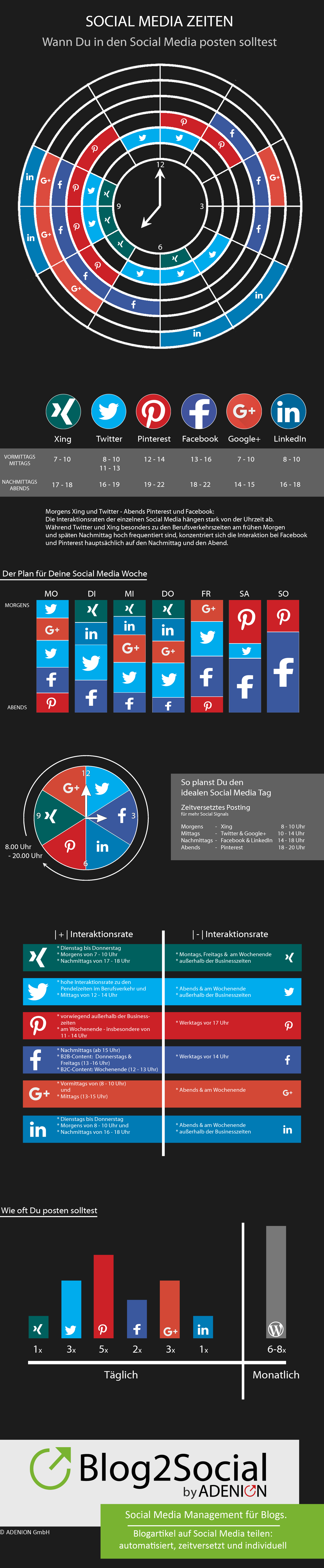
  • Social Media Post: Wann postet man am besten?

    Jeder Social Media-Kanal hat seine Tageszeiten, zu denen Nachrichten und Beiträge die höchte Reichweite besitzen. Eine Infografik zeigt die optimalen Zeiten.

    Quelle: Social Media Post: Wann postet man am besten?

  • Infografik: Die besten Zeiten für Social Media Beiträge

    Die Infografik von Blog2Social zeigt die besten Zeiten für Social Media Beiträge und liefert Tipps für besseres Social Media Management.

    Quelle: Infografik: Die besten Zeiten für Social Media Beiträge

  • Create a website style guide


    A website style guide is an ideal way to ensure brand identity, professionalism and consistency across your site. Steve Fisher explains how to go about writing one.

    Source: Speckyboy Design News
  • Principles of headline-style capitalization

    Quelle: The Chicago Manual of Style

    The conventions of headline style are governed mainly by emphasis and grammar. The following rules, though occasionally arbitrary, are intended primarily to facilitate the consistent styling of titles mentioned or cited in text and notes:

    1. Capitalize the first and last words in titles and subtitles (but see rule 7), and capitalize all other major words (nouns, pronouns, verbs, adjectives, adverbs, and some conjunctions— but see rule 4).

    2. Lowercase the articles the, a, and an.

    3. Lowercase prepositions, regardless of length, except when they are used adverbially or adjectivally (up in Look Up, down in Turn Down, on in The On Button, to in Come To, etc.) or when they compose part of a Latin expression used adjectivally or adverbially (De Facto, In Vitro, etc.).

    4. Lowercase the conjunctions and, but, for, or, and nor.

    5. Lowercase to not only as a preposition (rule 3) but also as part of an infinitive (to Run, to Hide, etc.), and lowercase as in any grammatical function.

    6. Lowercase the part of a proper name that would be lowercased in text, such as de or von.

    7. Lowercase the second part of a species name, such as fulvescens in Acipenser fulvescens, even if it is the last word in a title or subtitle.

    Siehe auch: EGGads! Capital Headline Mistakes

  • Stilfragen?

    [browsershot url=“http://www.chicagomanualofstyle.org“ width=“620″]

  • Tips for concise excerpts/summaries

      1. Prefer short words. E.g., write “use”, not “utilize” (unless you mean “utilize”).
      2. Prefer simple constructs. E.g., say “because”, “since”, or “as”, not “due to the fact that”.
      3. Prefer verbs to abstract nouns. Abstract nouns are longer and less lively (and also lead to lengthier and clumsier constructions).
      4. Use adjectives and adverbs sparingly. Does that adjective really need an adverb to qualify it?
      5. Read over to remove needless words.
      6. Read over again.

      > op111.net