Kategorie: Unsortiert
-
Photoshop Scripts and Extensions to Improve Your Workflow | Elevate – A Chicago Digital Agency
Photoshop Scripts and Extensions to Improve Your Workflow
Quelle: Photoshop Scripts and Extensions to Improve Your Workflow | Elevate – A Chicago Digital Agency
-
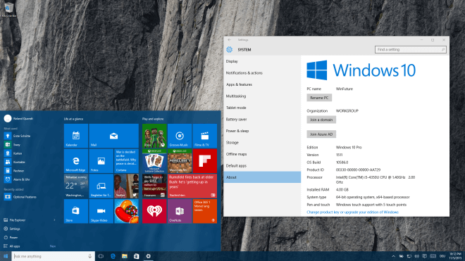
Layrs Control 2 – free PS extension
7 useful Photoshop scripts combined into one cool free extension. Now version 2 included 2 new scripts and compatibility with Photoshop CC & CC 2014
-
(Solution) Contact Form 7 Issues – „Your contact form has a configuration issue“ | Wiyre
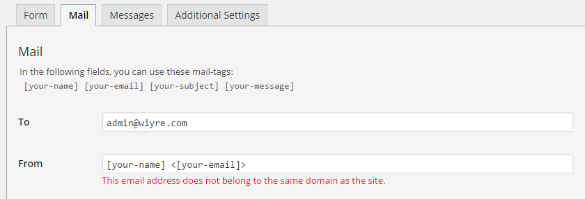 Solution to: “This email address does not belong to the same domain as the site.”
Quelle: (Solution) Contact Form 7 Issues – „Your contact form has a configuration issue“ | Wiyre
-
font design | One1more2time3’s Weblog
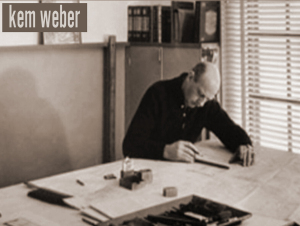
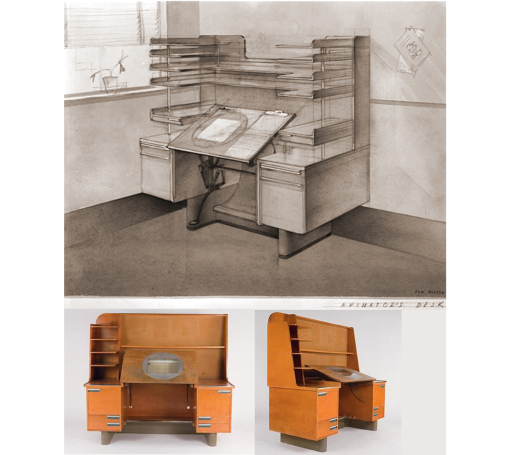 KEM WEBER, 1889 – 1963, born in berlin, germany, was a furniture- and industrial designer, an architect, art director and teacher. his first name KEM is the short for his full name KARL EMANUEL MARTIN. before he enrolled at the school of decorative arts in berlin in 1908, where he studied with BRUNO PAUL, he was trained as a cabinet maker. already in 1910 he became involved in the construction of the german pavilion at the the brussels world fair. after graduating in 1912 kem worked for the german governmen
 -
Volksbühne Berlin Poster Campaign – Fonts In Use
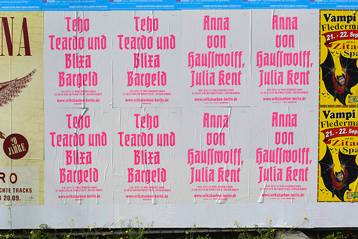 So, what to make of this? I’m on the fence here. On one hand, I’m a sucker for blackletter type, and I love to see it in contemporary use. On the other, I wonder whether it was necessary to include Potsdam and Nürnberg in the mix. What’s in a name? Well, see above. Does the Volksbühne really want to put itself into this lineage? Why tie in with the aesthetics of the theater’s darkest years? If blackletter, why not something more recent like Kaas, Moyenage, Fakir, Rostrot, Brokenscript? There are countless unsuspicious typefaces that would fulfill the conditions of being attention-grabbing and unused in the theater world.I guess I know the answers. One is: It wouldn’t matter, because laymen will peg just any blackletter as “Nazi type”, irregardless of its origin. How ironic. Make no mistake — LSD is very much aware of the status of blackletter as Nazi victim. Leonard Neumann: We have provided the theater staff with background material on the ban of Fraktur in Nazi Germany from 1941 on. This way, the intended unsettledness [of the audience] may lead to obtaining an information that actually is not one-dimensional. The true reason for banning blackletter and defaming it as “Jewish” was the fact that it was considered illegible outside of Germany, and hence was in the way to world domination somehow. It’s a good example for how propaganda works.The other answer is: Volksbühne doesn’t have to be “tasteful”, let alone politically correct. They want to provoke. And they come off best by choosing the most extreme option — not Bastard, but “the real thing”. I find this kind of provocation a little superficial and maybe too easy, but its effectiveness is hard to deny. I’ll give them that: The Volksbühne is likely the only institution that gets away with bringing Potsdam and Nürnberg back to the streets of Berlin.
 -
Paul Shaw Letter Design » From the Archives no. 24—German printing trade magazines in the 1930s
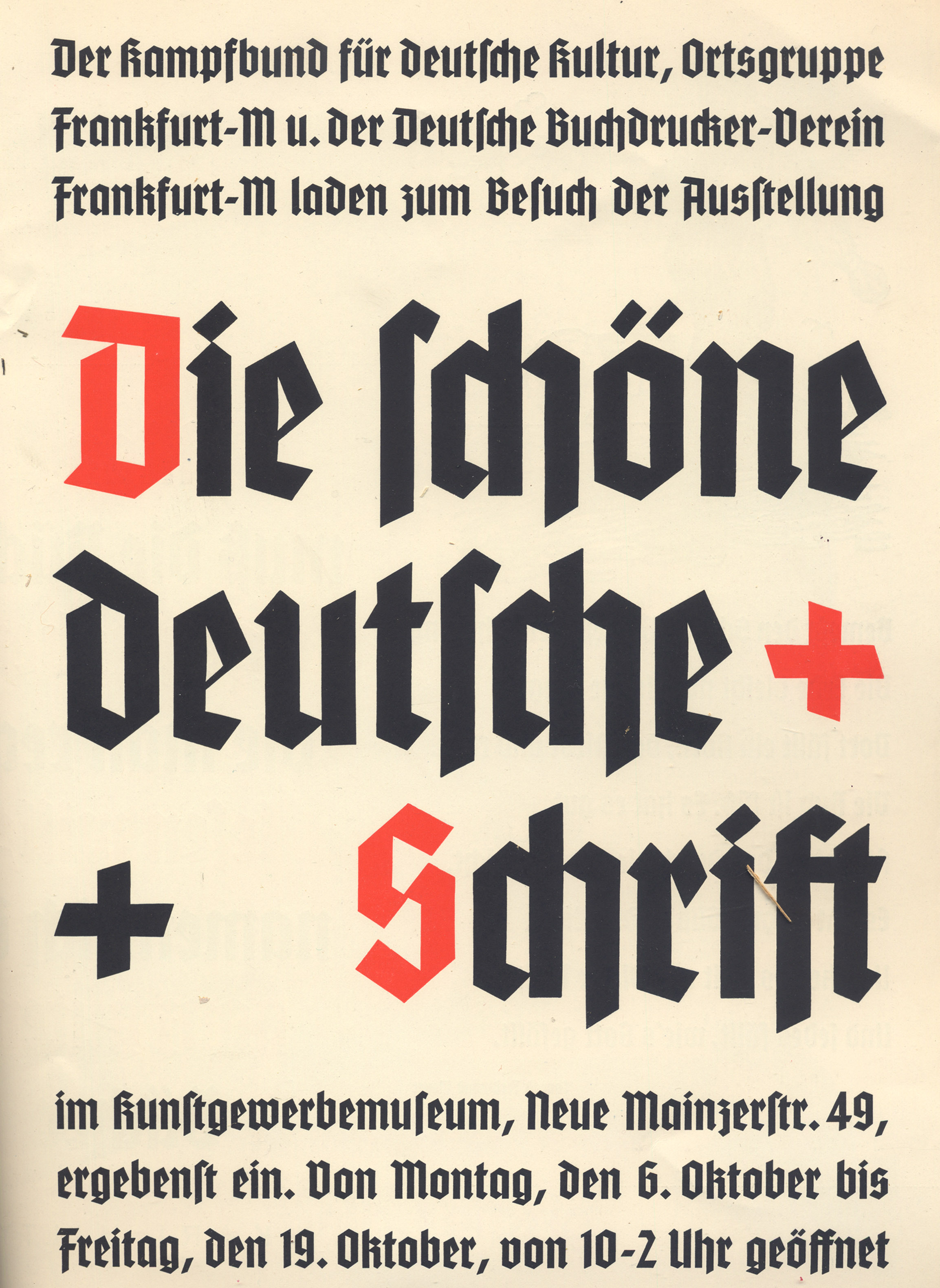 There are four typefaces advertised in the issue, two texturas in the new schaftstiefelgrotesk style and two Baroque frakturs: a double-page insert for Tannenberg Schmale (with text announcing an exhibition of “Die schöne deutsche Schrift” sponsored by the Kampfbund für Deutsche Kultur in the Kunstegewerbemuseum in Frankfurt) from D. Stempel AG, a quarter-page advertisement for Leibniz-Fraktur from Genzsch & Heyse AG, another quarter-page advertisement for Standarte (described as “Eine neuer schöner Ausdruck deutschen Formwillens”) from Schelter & Giesecke, and the back cover dedicated to Original Breitkopf-Fraktur (described as “Eine charaktervolle deutsche Schrift für das gute Buch und für die Akzidenz…”) from Ludwig Wagner AG. The Standarte showing is accompanied by Rhythmus, a Futura clone. The mix of new, modernist-inflected blackletter faces and classical, literary ones symbolizes two different visions of German greatness, those looking to the industrial future—the advertisement for Mergenthaler Setzmaschinen-Fabrik GmbH is set in Tannenberg Schmale—and those looking to the cultural past.
Quelle: Paul Shaw Letter Design » From the Archives no. 24—German printing trade magazines in the 1930s
-
Schaftstiefelgrotesk | Typophile
A style of blackletter type popularized in the 20th century that split the distance between the heavy industrial grotesques popular in the West (such as Akzidenz Grotesk) and the blackletter types predominant in the Teutonic world. Hitler, who had a preference for classic Roman imperial inscriptional letters, was one of the chief exponents of this style of type, which became explicitly identified with Nazi ideas of German nationalism. The names of the typefaces — Deutschland, National, Tannenberg — reveal this connection. Schaftstiefelgrotesks bear the same relationship to traditional German blackletters that grotesque sans serif types do to traditional serifed Latin type: they are simplified, weighted versions of the forms, sturdier and less refined. The name, given to the style by typesetters, is ironic. Of all the types sullied by association with the Nazis, they are the most problematic.
Quelle: Schaftstiefelgrotesk | Typophile
-
Berechnen des Unterschieds zwischen zwei Zeitangaben – Excel
Berechnen des Unterschieds zwischen zwei Zeitangaben
Quelle: Berechnen des Unterschieds zwischen zwei Zeitangaben – Excel
-
Computerdienstleistungen und technischer Support in Berlin
Computerdienstleistungen und technischer Support in Berlin
Quelle: Computerdienstleistungen und technischer Support in Berlin
-
Orange Box – Made with attention to detail
Made with attention to detail
-
Sherlock Holmes Fan: Loads of Interesting Holmes Info
Find Loads of Interesting Holmes Info Here!
Quelle: Sherlock Holmes Fan: Loads of Interesting Holmes Info
-
Praktische CSS Kurzschreibweisen Im Überblick | Elmastudio
Praktische CSS Kurzschreibweisen im Überblick
Quelle: Praktische CSS Kurzschreibweisen Im Überblick | Elmastudio
-
UI8 — Categories — Fonts
Our premium collection of handcrafted fonts
Quelle: UI8 — Categories — Fonts
-
(2) Brush Script Fonts auf Pinterest
A list of popular brush-script fonts & typefaces giving a hand-lettered, hand-drawn type feel.
-
Staff Picks: Our 18 Favorite Handwritten Fonts ~ Creative Market Blog
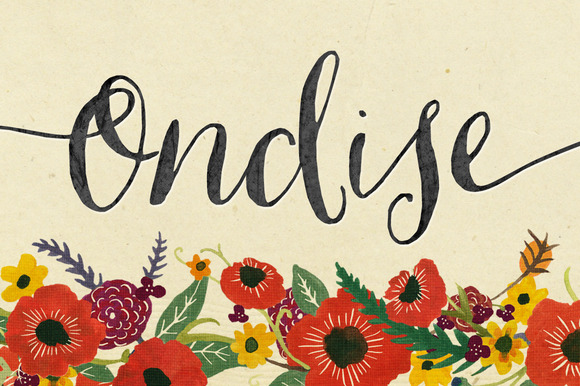
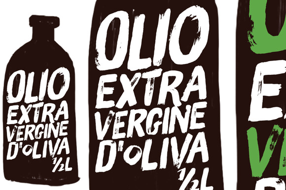 Staff picks is a regular series where we take a look at some of the personal favorites of the Creative Market Staff. We’ll choose a
Quelle: Staff Picks: Our 18 Favorite Handwritten Fonts ~ Creative Market Blog
-
Working Space Comparison: sRGB vs. Adobe RGB 1998
sRGB vs. ADOBE RGB 1998
-
Amazon.com: eero Home WiFi System
 Amazon.com: eero Home WiFi System
 -
YouGov Profiles LITE
YouGov Profiles LITE – the amazing new segmentation tool from YouGov
Quelle: YouGov Profiles LITE
-
CSS :nth-child, nth-of-type, :not, :empty, :only-child, :enabled | mediaevent.de
E:emptyElemente ohne Inhaltli:empty { background: blue }
Quelle: CSS :nth-child, nth-of-type, :not, :empty, :only-child, :enabled | mediaevent.de
-
License of our free stock photos – Pexels
It’s hard to understand complex licenses that is why all photos on Pexels are licensed under the Creative Commons Zero (CC0) license. This means the pictures are completely free to be used for any legal purpose.
-
BGH zum Urheberrecht bei Collagen und Mashups › kunstrecht, Urheberrecht, zitatrecht › Urheberrecht › Rechtsanwalt Ferner Aachen Alsdorf › Rechtsanwalt Ferner – Alsdorf, Region Aachen
Ich habe in der Vergangenheit, noch kurz vor dieser Entscheidung, u.a. einen Künstler beraten der seine Werke in Form so genannter Mashups (dazu hier) gestaltet. Schon seinerzeit war ich skeptisch und muss diesbezüglich mit Blick auf die inzwischen vorliegende BGH-Entscheidung feststellen, dass „einfach nur zusammenklatschen“ auf keinen Fall funktionieren wird. Vielmehr muss man letztendlich ein Werk präsentieren, das sich nicht alleine in dem Zusammenfügen der Inhalte erschöpft. Man wird bemüht sein müssen
-
Collage – Wikiwand
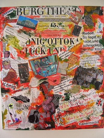 UrheberrechtUrheberrechtlich ist die Collage umstritten. Man kann in ihr eine unfreie Bearbeitung, bei der die Genehmigung der Werke fremder Urheber eingeholt werden muss, oder eine freie Bearbeitung sehen. Eine freie Bearbeitung liegt vor, wenn der Eindruck des Originals gegenüber demjenigen der neuen Werke „verblasst“.[2]
Quelle: Collage – Wikiwand
-
What is my screen resolution/display resolution? – Screen resolution statistics
What is my screen resolution/display resolution? Online screen tester, shows the screen resolution of your current monitor, provides screen resolution realtime statistics.
Quelle: What is my screen resolution/display resolution? – Screen resolution statistics
-
WordPress – How to enqueue script to child theme | Treehouse Community
Participate in discussions with other Treehouse members and learn.
Quelle: WordPress – How to enqueue script to child theme | Treehouse Community
-
Child Themes « WordPress Codex
The final step is to enqueue the parent and child theme stylesheets. Note that the previous method was to import the parent theme stylesheet using @import: this is no longer best practice. The correct method of enqueuing the parent theme stylesheet is to add a wp_enqueue_scripts action and use wp_enqueue_style() in your child theme’s functions.php.
Quelle: Child Themes « WordPress Codex
-
Avada and WPML Multilingual Site
 Putting Together a Multilingual Site with Avada and WPML No matter where in the world you are as a site owner or developer, having to put together multilingual sites is an increasingly common requirement. How best to do this using Avada is also a support question that pops up quite a lot here at Theme Fusion. The recommended route is to use the market-leading multilingual WPML plugin to arrange your translations.
Quelle: Avada and WPML Multilingual Site
-
portable – How to migrate Notepad++ settings? – Super User
How to migrate Notepad++ settings?
Quelle: portable – How to migrate Notepad++ settings? – Super User
-
CSS Media Queries for Mobile Devices – Blog of Andreas Norman Blog of Andreas Norman
Writing CSS for different devices can be a pain in the ass. With Media Queries it’s easier, if you know how to pin point a specific device.
Quelle: CSS Media Queries for Mobile Devices – Blog of Andreas Norman Blog of Andreas Norman
-
WeePie Cookie Allow – EU Cookie Law Compliance Plugin – WordPress | CodeCanyon
WeePie Cookie Allow – EU Cookie Law Compliance Plug
Quelle: WeePie Cookie Allow – EU Cookie Law Compliance Plugin – WordPress | CodeCanyon
-
Symbolische Verknüpfung – Wikiwand
Seit Windows Vista bzw. Windows Server 2008 (beide intern Windows NT 6.0) stehen über die Win32-API echte symbolische Verknüpfungen zur Verfügung, die transparent im Dateisystem vorliegen und auf Dateien und Verzeichnisse des eigenen Computers verweisen können. Symbolische Verknüpfungen können eine relative Zielangabe enthalten.
Zum Anlegen dieser symbolischen Verknüpfung wird das Recht Create Symbolic Link benötigt. Dieses steht standardmäßig nur Benutzern mit Administratorrechten zur Verfügung. Weiterhin muss beim Anlegen der Verknüpfung bekannt sein, ob das Ziel eine Datei oder ein Verzeichnis ist. Aus diesen Gründen sind die symbolischen Verknüpfungen von Windows nicht vollständig kompatibel zu POSIX.