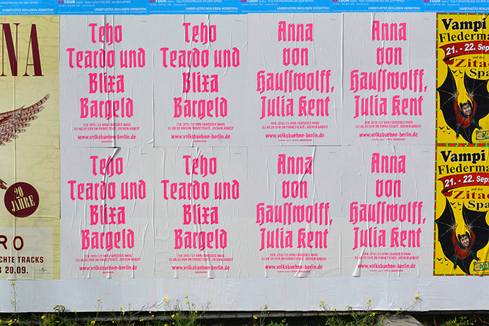
 So, what to make of this? I’m on the fence here. On one hand, I’m a sucker for blackletter type, and I love to see it in contemporary use. On the other, I wonder whether it was necessary to include Potsdam and Nürnberg in the mix. What’s in a name? Well, see above. Does the Volksbühne really want to put itself into this lineage? Why tie in with the aesthetics of the theater’s darkest years? If blackletter, why not something more recent like Kaas, Moyenage, Fakir, Rostrot, Brokenscript? There are countless unsuspicious typefaces that would fulfill the conditions of being attention-grabbing and unused in the theater world.I guess I know the answers. One is: It wouldn’t matter, because laymen will peg just any blackletter as “Nazi type”, irregardless of its origin. How ironic. Make no mistake — LSD is very much aware of the status of blackletter as Nazi victim. Leonard Neumann: We have provided the theater staff with background material on the ban of Fraktur in Nazi Germany from 1941 on. This way, the intended unsettledness [of the audience] may lead to obtaining an information that actually is not one-dimensional. The true reason for banning blackletter and defaming it as “Jewish” was the fact that it was considered illegible outside of Germany, and hence was in the way to world domination somehow. It’s a good example for how propaganda works.The other answer is: Volksbühne doesn’t have to be “tasteful”, let alone politically correct. They want to provoke. And they come off best by choosing the most extreme option — not Bastard, but “the real thing”. I find this kind of provocation a little superficial and maybe too easy, but its effectiveness is hard to deny. I’ll give them that: The Volksbühne is likely the only institution that gets away with bringing Potsdam and Nürnberg back to the streets of Berlin.
Quelle: Volksbühne Berlin Poster Campaign – Fonts In Use