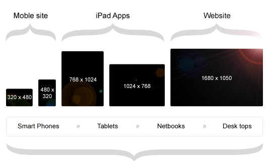
Being that responsive design has not been widely adopted until recently – it is in a stage of genetic mutation. Currently, there are 2 main branches of thought in terms of how content should be presented.Breakpoints or Fluid?BreakpointsBreakpoints are established using the css concept of media queries.The Breakpoint approach typically supports 3 or 4 views (laptop, ipad vertical, mobile).Supported by GetSkeleton, Bootstrap and many other frameworks.The strength of this approach is that you can present the right size content for almost all of your target audience. The weakness is that you are still restricting your contents ability to adapt.FluidFluid spans 100% of the browser width, but is typically limited to a maximum width.This approach is created by using fluid columns and media queries to change column sizes.Supported by cssgrid.net, Bootstrap and others.The benefit is that your design will fit any device screen size. Instead of being optimized for 3 sizes, your design can have full-screen impact on a variety of monitor sizes, tablets and cell phones. The weakness is that design elements must be re-thought and simplified (not always bad), and that coding the CSS becomes much more challenging.
Quelle: Responsive Web Design Breaking the Box Responsive Breakpoints vs Fluid