WordPress can be slow if not optimized correctly. In this guide, we will show you 18 tips on how to speed up WordPress with our web performance strategies.
Remove Query Strings from Static Resources – KeyCDN Support
For WordPress users there are a few options available when wanting to remove query strings from static resources. Here are a few suggestions:
Quelle: Remove Query Strings from Static Resources – KeyCDN Support
Die wichtigsten non-destruktiven Photoshop-Techniken + Tipps, Tricks & Videos | kulturbanause® blog
Wer kreativ arbeitet, probiert aus, nimmt häufig Korrekturen und Anpassungen vor und verwirft die Entscheidungen evtl. einen Tag später wieder. Um trotz des sprunghaften Ablaufs effektiv zu sein, sollte man möglichst wenig Pixel unwiederbringlich zerstören. Korrekturen lassen sich nur so schnell und unkompliziert vornehmen. Dieses Prinzip nennt sich non-destruktives oder verlustfreies Arbeiten und ist die Basis eines professionellen Workflows. Mit jeder Photoshop-Version kommen neue verlustfreie Methoden hi
Quelle: Die wichtigsten non-destruktiven Photoshop-Techniken + Tipps, Tricks & Videos | kulturbanause® blog
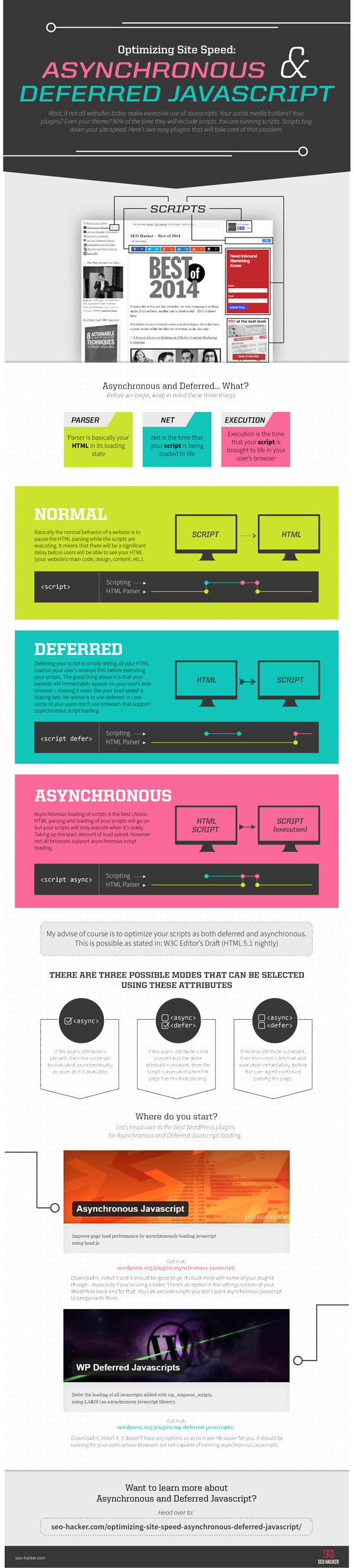
Optimizing Site Speed: Asynchronous and Deferred Javascript
6 Panel Digipak -Center Tray Mock Up Set | Cover Actions Premium
CD Digipak Mock Up & PSD Template
Quelle: 6 Panel Digipak -Center Tray Mock Up Set | Cover Actions Premium
Content Seeding Grundlagen – Definition, Planung und Strategie – Content Seeding 101
Content Seeding gehört zu den Grundpfeilern jeder zeitgemäßen Linkbuilding und Content Marketing Kampagne im SEO. Denn der Erfolg einer Kampagne bemisst sich immer darin, wie konsequent und effektiv das Seeding, sprich: das Streuen der angebotenen Inhalte unter der anvisierten Zielgruppe war. Auf Nachhaltigkeit bedachte Webseitenbetreiber haben für ihre Seiten natürlich immer schon hochwertigen Content erstellt. Der jüngere Trend der SEO-Szene hin zum aktuellen Buzz-Word Content Marketing sollte deshalb all jenen endlich Recht geben, denen immer schon wichtig war, den Besuchern ihrer Seiten mal unterhaltende, mal informative Mehrwerte zu bieten und sie nicht nur direkt als Kunden anzuwerben.
Quelle: Content Seeding Grundlagen – Definition, Planung und Strategie – Content Seeding 101
Seeding Content In Social Media For The Biggest Impact
So now you have an amazing piece of content and you want to share it with the world. By instinct you might rush to Facebook or Twitter to blast it to all your friends. But if you are a smart marketer you will want to develop a social sharing strategy that is designed to grow the content’s reach over time. This is called “social seeding”. In this post we are going to explore the best tactics for social seeding on 4 popular networks. With in each network we will discus three areas: Packaging, Delivery, and Growth.
Quelle: Seeding Content In Social Media For The Biggest Impact
Content Seeding | Textbroker
Content seeding is a strategic approach to scatter content across the Internet. Content creators spread content to various locations where that content will be read, noticed and spread. Often, content creators target relevant influencers in hopes that those well-connected influencers use their own networks to distribute the content. This marketing approach aims to increase brand awareness by pushing content across the web to relevant target groups.
Quelle: Content Seeding | Textbroker
Insights: New Facebook Page Design 2016 | Rudi Gabriel Bedy – Online Marketing
Facebook works again on a new design for it’s Pages. In the new design they mostly changed the public view of the Facebook Page, but also the Admin view.
Quelle: Insights: New Facebook Page Design 2016 | Rudi Gabriel Bedy – Online Marketing
Facebook’s testing another ad-free Pages design for desktop
Facebook is testing a new look for its desktop Pages that drops right-hand ads and repositions the page’s cover photo, profile photo and navigation bar.
Quelle: Facebook’s testing another ad-free Pages design for desktop
Organischer Linkaufbau mit der Sauercrowd — Sauercrowd
Die Cans of Links ermöglichen nachhaltigen Linkaufbau mit natürlichen Backlinks für eine erfolgreiche Steigerung der Sichtbarkeit.
Quelle: Organischer Linkaufbau mit der Sauercrowd — Sauercrowd
A Guide to Content Seeding
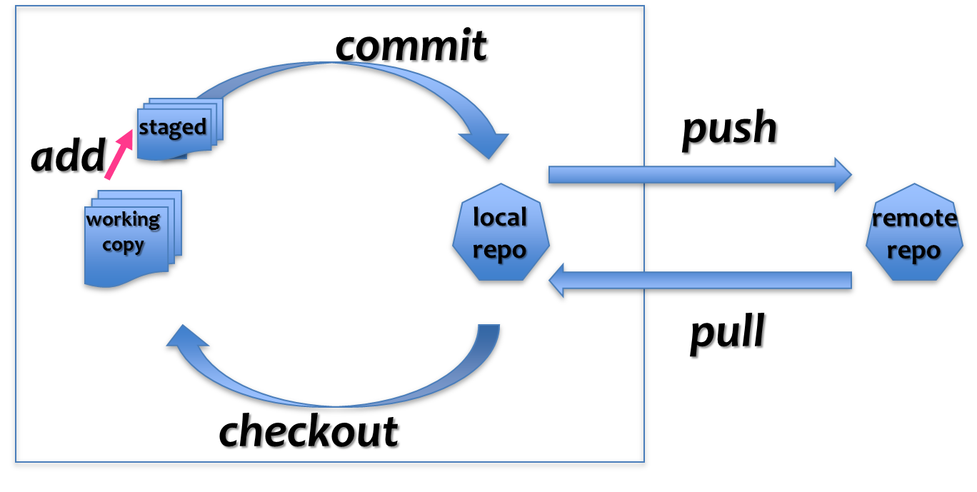
Einfacher Arbeitsablauf in Git – als Präsentation
photoshop farbprofil installieren windows › Blogs54
Der Speicherort, wo bei Windows (Win XP, Vista, Win7 und Win8) die Farbprofile liegen befindet sich unter:
c:WindowsSystem32spooldriverscolor
Right Click Enhancer – RBSoft
Right Click Enhancer allows user to take total control of their right click context menu.
Quelle: Right Click Enhancer – RBSoft
How To Fix Appvisvsubsystems32.dll is Missing / Not Found Error
How To Fix Appvisvsubsystems32.dll Errors
Quelle: How To Fix Appvisvsubsystems32.dll is Missing / Not Found Error
Der New Yorker Grafikdesigner Ji Lee verwandelt Wörter in Bilder : Business Punk
Jedes Bild bringt es auf den Punkt.
Quelle: Der New Yorker Grafikdesigner Ji Lee verwandelt Wörter in Bilder : Business Punk
Fully half of web users say they expect a website to load within two seconds. Meanwhile, the average page on a mobile device loads in seven seconds.
The conclusion is simple: First impressions count. Clog up your site with unnecessarily large images and you risk antagonizing your visitors straight out of the gate.
Quelle: A Comprehensive Guide to WordPress Image Optimization – Theme Fusion
Co.Design | business + design

Inspiring stories about innovation and business, seen through the lens of design.
Quelle: Co.Design | business + design
WordPress › Support » Prevent span tags from being removed
function myextensionTinyMCE($init) {
    // Command separated string of extended elements
    $ext = 'span[id|name|class|style]';

    // Add to extended_valid_elements if it alreay exists
    if ( isset( $init['extended_valid_elements'] ) ) {
        $init['extended_valid_elements'] .= ',' . $ext;
    } else {
        $init['extended_valid_elements'] = $ext;
    }

    // Super important: return $init!
    return $init;
}

add_filter('tiny_mce_before_init', 'myextensionTinyMCE' );
# Wenn du die Bilder löscht, müssten Sie für alle weg sein.
Du kannst aber, wenn du den Ordner erstellt hast, zunächst den anderen die Freigaben entziehen („Freigabe des Ordners aufheben“).
Dann wirst du automatisch gefragt, ob du möchtest, dass die anderen Nutzer eine Kopie des Inhaltes behalten können („Andere Nutzer dieses freigegebenen Ordners sollen eine Kopie dieser Dateien behalten können“).
Wenn du dann in dem Kästchen vor diesem Satz ein Kreuz machst, behalten deine Mitkommilitonen jeweils eine Kopie in ihren Dropboxen.
Danach kannst du dann gefahrlos in deiner Dropbox löschen, um wieder Speicherplatz zu gewinnen.
Mache ich jedenfalls immer so und hat bisher ausnahmslos problemlos geklappt.
As an illustrator it is really important to focus your portfolio on the area that you most want to work. Clients are inherently risk averse, to a large extent they want to know what they are getting. You need to have at least 10 good editorial pieces in your portfolio.creativebloq
1&1 Hilfe Center – Kundendaten ändern – Namensänderung per Formular
Kundendaten ändern – Namensänderung per FormularFür 1&1 Hosting-Verträge
Quelle: 1&1 Hilfe Center – Kundendaten ändern – Namensänderung per Formular
The Web Robots Pages
About /robots.txtIn a nutshellWeb site owners use the /robots.txt file to give instructions about their site to web robots; this is called The Robots Exclusion Protocol.
Quelle: The Web Robots Pages
Links gelten im Bereich des Online Marketings als Währung – je mehr (möglichst qualitativ hochwertige) Verweise auf eine Webseite existieren, desto wichtiger wird sie für Google bei relevanten Suchanfragen. Mit zusammen 40,09 Prozent sprechen die SEO Experten diesem Bereich mitunter die größte Bedeutung zu und unterscheiden dabei zwischen Verlinkungen auf Domainebene (Anzahl und Qualität an Links, die auf eine Domain verweisen) und Verlinkungen auf Seitenebene (Anzahl und Qualität an Links, die auf einzelne Unterseiten verweisen). Eine wichtige Rolle spielt hierbei die themenspeziefische Relevanz und Variation der Linktexte sowie der Vertrauensstatus (TrustRank), den die Linkquellen bei Google genießen.seo-summary.de/google-ranking-faktoren/
Linkbaiting: 10 SEO-Tricks Mehr Backlinks | Karrierebibel.de
Es ist ein paar Jahrhunderte her, da haben Alchemisten ahnungslosen Königen weisgemacht, sie könnten Blei in Gold verwandeln. Die Sache ging in der Regel doppelt schlecht aus: Die Könige blieben auf dem Schwermetall sitzen, und die Alchemisten verloren den Kopf. Gut 300 Jahre läuft das genauso: Suchmaschinenoptimierung (kurz: SEO)
Quelle: Linkbaiting: 10 SEO-Tricks Mehr Backlinks | Karrierebibel.de
Add Font Awesome icons with CSS, with character Cheatsheet
Font Awesome CSS Character Cheatsheet
Quelle: Add Font Awesome icons with CSS, with character Cheatsheet
Hug a Designer | A curated collection of outstanding digital products from talented designers around the world. Ready to download and use today.
A curated collection of outstanding digital products from talented designers around the world. Ready to download and use today.
Envato Stories – Muhammad (Avada / ThemeFusion) – YouTube
Photoshoplr
madebyvadim
Quelle: Photoshoplr
Photoshop Scripts and Extensions to Improve Your Workflow | Elevate – A Chicago Digital Agency
Photoshop Scripts and Extensions to Improve Your Workflow
Quelle: Photoshop Scripts and Extensions to Improve Your Workflow | Elevate – A Chicago Digital Agency
Layrs Control 2 – free PS extension
7 useful Photoshop scripts combined into one cool free extension. Now version 2 included 2 new scripts and compatibility with Photoshop CC & CC 2014
The 12 Best Free Photoshop Plugins for Designers
(Solution) Contact Form 7 Issues – „Your contact form has a configuration issue“ | Wiyre
Solution to: “This email address does not belong to the same domain as the site.”
Quelle: (Solution) Contact Form 7 Issues – „Your contact form has a configuration issue“ | Wiyre
Simple and Accurate Asset Exporting with PNG Express V2 for Photoshop – YouTube
font design | One1more2time3’s Weblog
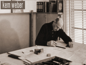
KEM WEBER, 1889 – 1963, born in berlin, germany, was a furniture- and industrial designer, an architect, art director and teacher. his first name KEM is the short for his full name KARL EMANUEL MARTIN. before he enrolled at the school of decorative arts in berlin in 1908, where he studied with BRUNO PAUL, he was trained as a cabinet maker. already in 1910 he became involved in the construction of the german pavilion at the the brussels world fair. after graduating in 1912 kem worked for the german governmen
Volksbühne Berlin Poster Campaign – Fonts In Use
So, what to make of this? I’m on the fence here. On one hand, I’m a sucker for blackletter type, and I love to see it in contemporary use. On the other, I wonder whether it was necessary to include Potsdam and Nürnberg in the mix. What’s in a name? Well, see above. Does the Volksbühne really want to put itself into this lineage? Why tie in with the aesthetics of the theater’s darkest years? If blackletter, why not something more recent like Kaas, Moyenage, Fakir, Rostrot, Brokenscript? There are countless unsuspicious typefaces that would fulfill the conditions of being attention-grabbing and unused in the theater world.I guess I know the answers. One is: It wouldn’t matter, because laymen will peg just any blackletter as “Nazi type”, irregardless of its origin. How ironic. Make no mistake — LSD is very much aware of the status of blackletter as Nazi victim. Leonard Neumann: We have provided the theater staff with background material on the ban of Fraktur in Nazi Germany from 1941 on. This way, the intended unsettledness [of the audience] may lead to obtaining an information that actually is not one-dimensional. The true reason for banning blackletter and defaming it as “Jewish” was the fact that it was considered illegible outside of Germany, and hence was in the way to world domination somehow. It’s a good example for how propaganda works.The other answer is: Volksbühne doesn’t have to be “tasteful”, let alone politically correct. They want to provoke. And they come off best by choosing the most extreme option — not Bastard, but “the real thing”. I find this kind of provocation a little superficial and maybe too easy, but its effectiveness is hard to deny. I’ll give them that: The Volksbühne is likely the only institution that gets away with bringing Potsdam and Nürnberg back to the streets of Berlin.
Paul Shaw Letter Design » From the Archives no. 24—German printing trade magazines in the 1930s
There are four typefaces advertised in the issue, two texturas in the new schaftstiefelgrotesk style and two Baroque frakturs: a double-page insert for Tannenberg Schmale (with text announcing an exhibition of “Die schöne deutsche Schrift” sponsored by the Kampfbund für Deutsche Kultur in the Kunstegewerbemuseum in Frankfurt) from D. Stempel AG, a quarter-page advertisement for Leibniz-Fraktur from Genzsch & Heyse AG, another quarter-page advertisement for Standarte (described as “Eine neuer schöner Ausdruck deutschen Formwillens”) from Schelter & Giesecke, and the back cover dedicated to Original Breitkopf-Fraktur (described as “Eine charaktervolle deutsche Schrift für das gute Buch und für die Akzidenz…”) from Ludwig Wagner AG. The Standarte showing is accompanied by Rhythmus, a Futura clone. The mix of new, modernist-inflected blackletter faces and classical, literary ones symbolizes two different visions of German greatness, those looking to the industrial future—the advertisement for Mergenthaler Setzmaschinen-Fabrik GmbH is set in Tannenberg Schmale—and those looking to the cultural past.
Quelle: Paul Shaw Letter Design » From the Archives no. 24—German printing trade magazines in the 1930s
Schaftstiefelgrotesk | Typophile
A style of blackletter type popularized in the 20th century that split the distance between the heavy industrial grotesques popular in the West (such as Akzidenz Grotesk) and the blackletter types predominant in the Teutonic world. Hitler, who had a preference for classic Roman imperial inscriptional letters, was one of the chief exponents of this style of type, which became explicitly identified with Nazi ideas of German nationalism. The names of the typefaces — Deutschland, National, Tannenberg — reveal this connection. Schaftstiefelgrotesks bear the same relationship to traditional German blackletters that grotesque sans serif types do to traditional serifed Latin type: they are simplified, weighted versions of the forms, sturdier and less refined. The name, given to the style by typesetters, is ironic. Of all the types sullied by association with the Nazis, they are the most problematic.
Quelle: Schaftstiefelgrotesk | Typophile